Sizing the Horizon: The Effects of Chart Size and Layering on the Graphical Perception of Time Series Visualizations
Jeffrey Heer, Nicholas Kong, Maneesh Agrawala
Abstract
We investigate techniques for visualizing time series data and evaluate their effect in value comparison tasks. We compare line charts with horizon graphs — a space-efficient time series visualization technique — across a range of chart sizes, measuring the speed and accuracy of subjects’ estimates of value differences between charts. We identify transition points at which reducing the chart height results in significantly differing drops in estimation accuracy across the compared chart types, and we find optimal positions in the speed-accuracy tradeoff curve at which viewers performed quickly without attendant drops in accuracy. Based on these results, we propose approaches for increasing data density that optimize graphical perception.
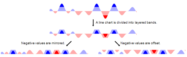
Horizon graph construction. A normal line chart is divided into bands defined by uniform value ranges. The bands are then layered to reduce the chart height. Negative values can be mirrored or offset into the same space as positive values.